Top Five Conversion Killers for Hotel Websites
Image credit: Hotel Proxy
Conversion is the process of turning your site visitors or leads to actual paying guests. In the realm of online marketing, the first step is to capture web traffic, direct them to your website and once they’re there, compel them to book with your hotel.
Of course, this is easier said than done.
Getting high conversion rates has been one of the problems for a hotel website. Your beautiful site may get good traffic and a significant number of visitors, but this traffic is not converted to direct bookings. Without conversion, your hotel’s website is just a very expensive online brochure that is leaking money and not generating enough revenue for your property.
So, what are the reasons behind a low-converting hotel website? Below, we enumerated the top five conversion killers and how you can solve them.
Slow Load Time
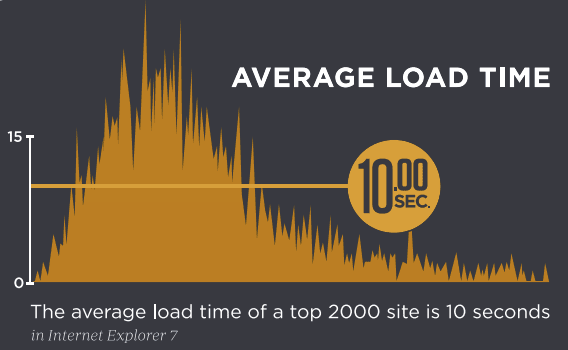
Image credit: RCN Marketing
We are all living in an “I-want-it-now-and-I-want-it-fast” era. Humans have a shorter attention span than a goldfish. Your prospective guests just don’t have the patience to wait for your hotel’s website to load. This is especially true for those who are using mobile devices to look for hotels. If your website doesn’t load in 3 seconds, they’ll close it and look for another hotel. Further, your conversion rate can decline by up to 7% for every second that your website takes to load.
It’s important that you constantly check your hotel website’s load time and to identify what’s slowing it down. Are the images too large? Is it because of how the website is structured? There are simple fixes that you or your staff can do while there are complicated problems that you would need the help of a professional web developer to fix.
Poor Navigation
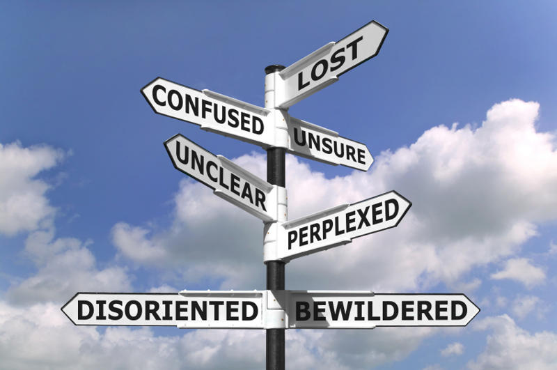
Image credit: http://www.bloggodown.com/
How do you expect your potential guests to complete the booking process if they can’t find their way around your website? Your website should be easy to navigate to help your prospects find the information they need. A logical and easy-to-understand menu structure and content hierarchy should be utilized.
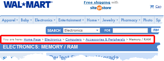
For example, if they want to know what your rates are, they should be able to see “Rates or Book Now” on your main menu. The booking process should also be easy to navigate – from choosing the room they want to book, entering their credit card information and completing the booking. This is where breadcrumbs become really helpful, especially if there are several steps in your checkout process.
Image credit: Code Project
Compatibility Issues

Image credit: Tech Dusts
Travelers are searching for hotels using different browsers – Chrome, Internet Explorer, Safari, Firefox and the list goes on. They are also using different devices – from smartphones, tablets, laptops and desktops and all these have different screen sizes and technical specifications.
When you design your website, you can’t have a one-size fits all approach because you have to ensure that it’s compatible, responsive and intuitive enough to automatically detect the browser and device that a potential guest might be using. You have the choice to focus on just one browser or one device screen size, but imagine the potential revenue that you might lost because of compatibility issues.
Higher Published Rates
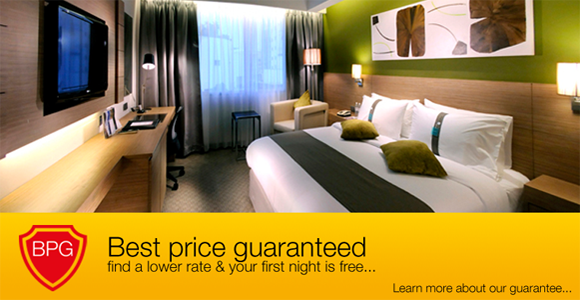
Image credit: Grand Margherita Hotel
Always assume that potential guests are using multiple channels or platforms other than your website. For sure, they have scoured social media sites, used local directories, Google Hotel Finder and online travel agencies. That said, they have seen and compared rates for your hotel across these channels. If they see that your website is showing higher rates, say, compared to an online travel agency, they would surely turn their backs away and not book with your directly.
Make sure that the published room rates on your site are the same with the other published rates for your hotel on third party sites. Having a best price guaranteed on your site is also a great way to boost your hotel website’s conversion rates, but you also have to take into consideration rate parities, especially if you have partner online travel agencies.
No Call to Action
Image credit: Jafaloo
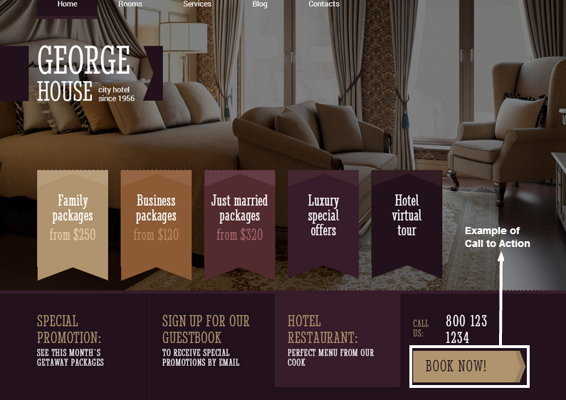
Marketing geniuses and co-founders of super successful digital marketing firm Ryan Deiss and Perry Belcher said that customers don’t want to think for themselves when it comes to making a purchase decision. In the context of hotels, you have to tell your potential guests exactly what to do, also known as call to action. If you want them to book a room, your call to action can be “Book Now.” If you have an ongoing special promo, your call to action can be “Claim Your Free Night.” If you want them to subscribe to your newsletter, your call to action can be “Sign Up Today.” Whatever it is, your call to action should be short, crisp, definitive, simple and single-minded. It should tell your potential hotel guests exactly what you want them to do.
Design-wise, your call to action should be the second most visually striking element on your page, only second to your headline. The area of your website where your call to action is should be prominent and should be free from any design clutter as to not distract potential guests. Also, the general rule of thumb is to only have one call to action. This is often referred to as the Paradox of Choice. The more options you give your hotel guests, the more difficult it would be for them to decide and eventually, not book with you at all.
Perform a Conversions Audit of Your Website Today
Immediately after reading this, use the checklist below to perform a conversions audit of your hotel’s website:
o Test the speed of your website. There are many programs/software out there that you can use. Compress all files that you can to make your site load faster.
o Go through your booking process and see if there are any navigation issues that need to be fixed.
o Ask your employees to view your hotel’s website using different devices and internet browsers.
o Compare the published rates on your site versus your hotel’s published rates on online travel agencies.
o Ask someone who hasn’t seen your website before to look at it for 30 seconds. After, ask him or her what the call to action is. If he can’t give it to you, you call to action is not clear enough.
We hope this helps you bring in more bookings via your hotel websites!

